Configurable TOC Sidebar Position in Arsxy Theme
Learn how to position your table of contents sidebar on either the left or right side of your posts
The Arsxy Theme now supports a configurable table of contents (TOC) sidebar position, allowing you to choose whether the sidebar appears on the left or right side of your posts. This feature gives you more control over your site’s layout and can help optimize the reading experience for your audience.
Flexible Sidebar Positioning
By default, the TOC sidebar appears on the right side of your posts. However, you can now easily change this to the left side through a simple configuration option. This flexibility allows you to:
- Match your readers’ preferences (some prefer the TOC on the left for easier navigation)
- Create a more traditional documentation layout with navigation on the left
- Experiment with different layouts to see what works best for your content
How to Configure Sidebar Position
Changing the position of your TOC sidebar is straightforward. You simply need to update a single setting in your _config.yml file:
# Theme-specific settings
toc_position: right # Options: 'left', 'right' (default)
Global Configuration
To set the sidebar position for your entire site, add or update the toc_position option in your _config.yml file:
- For a right sidebar (default):
toc_position: right - For a left sidebar:
toc_position: left
If you don’t specify a sidebar position, the theme will default to displaying the sidebar on the right.
Per-Page Configuration (Coming Soon)
In a future update, we’ll be adding the ability to override the global sidebar position setting on a per-page basis, giving you even more flexibility for specific posts or pages.
Examples
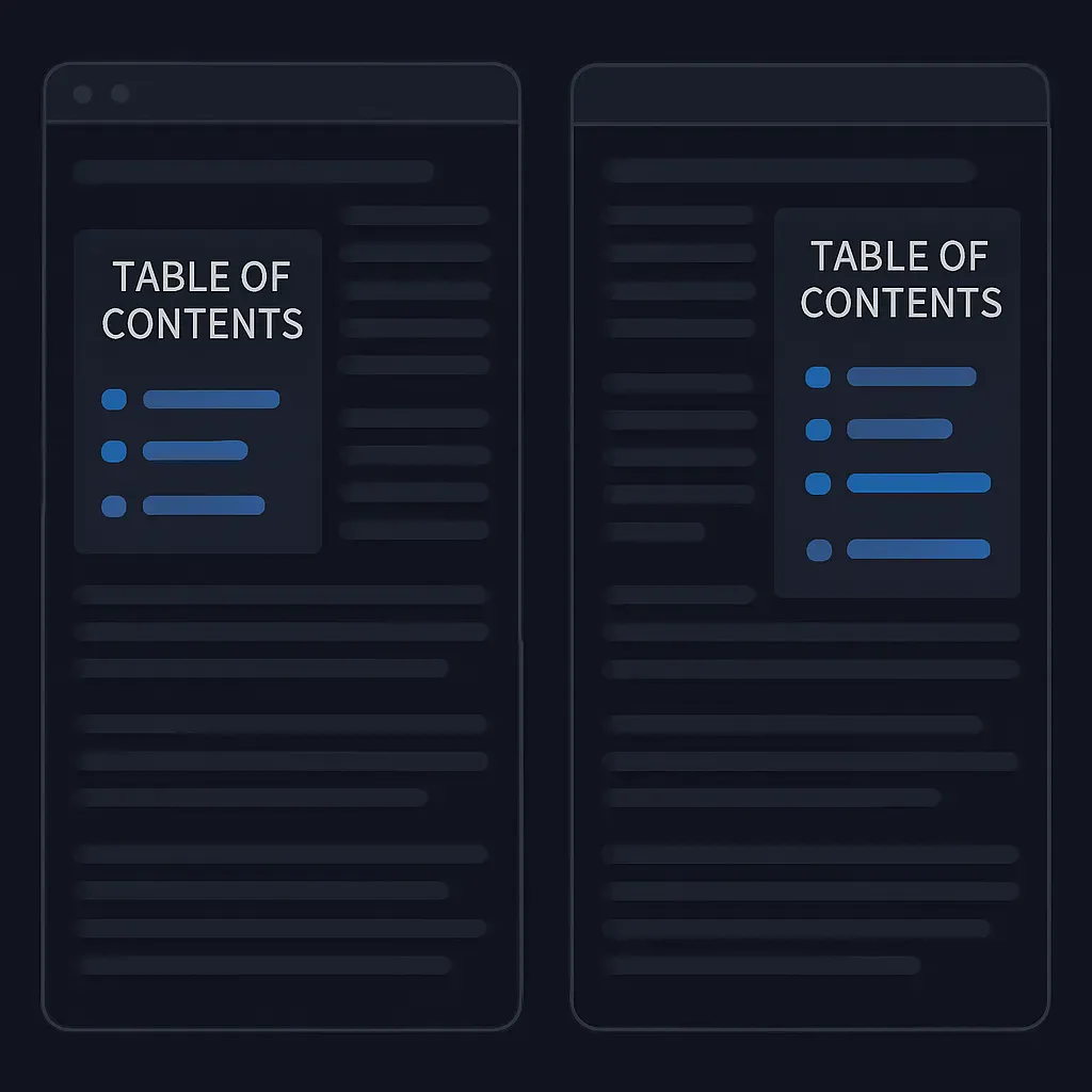
Right Sidebar (Default)
The default layout with the TOC sidebar on the right provides a familiar reading experience, with the content appearing first:
toc_position: right
This layout works well for most content, as readers naturally start reading from the left and can refer to the TOC on the right when needed.
Left Sidebar
Setting the sidebar to appear on the left creates a layout similar to many documentation sites:
toc_position: left
This arrangement is beneficial when navigation is the primary concern, as readers will see the table of contents first before diving into the content.
Responsive Behavior
Regardless of your sidebar position setting, the TOC remains responsive:
- On desktop and large tablet screens, the TOC appears in the configured position (left or right)
- On mobile and small screens, the TOC collapses to the top of the article for better readability
Design Considerations
When deciding on your sidebar position, consider these factors:
- Reading Direction: Most Western readers scan left-to-right, making the right sidebar less intrusive to the initial reading flow
- Content Priority: If navigation between sections is critical, a left sidebar puts the TOC front and center
- Visual Balance: Consider the overall balance of your page layout, including headers and other UI elements
Implementation Details
This feature was implemented using CSS Grid layout, which provides a clean way to reorder content without changing the HTML structure. The implementation maintains all existing TOC features, including:
- Smooth scrolling to sections
- Highlighting of the current section
- Automatic detection of headings
- Responsive behavior on smaller screens
Feedback
We’re always looking to improve the Arsxy Theme. If you have suggestions for enhancing the sidebar position feature or encounter any issues, please let us know by opening an issue on GitHub.
Happy blogging!

Comments